Preparing Charts and Graphs: Exhibit B
Anticipating the Effects of Reducing Image Size
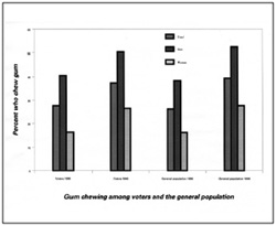
Fig. B.1 Original-sized chart before reduction. Fig. B.2. Illegible chart after reduction.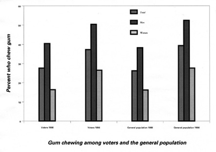
Line Rules:
Bounding rules that appear thin in the reduced image may fade and disappear when printed. The minimum rule size should be no smaller than 1 pt in the large original.
The boldness of rules that are too thick around data columns adds unnecessary emphasis. The maximum rule size should be no larger than 2 pts in the large original.
Fonts:
Column and row headings that are legible at full size may become unreadable when reduced to fit in a book. If you are working with oversized art, reduce your printouts to the width that will be used in the book to make sure your type is clear.
Use one font throughout the figure. If two different sizes are utilized, they should vary from each other only slightly (e.g., 10 pt and 12 pt, not 10 pt and 18 pt).
Font styles should be used sparingly. Generally, there is no reason to use bold or italic.
Do not use all CAPS as this decreases overall legibility.
Tint variations:
Tint variations that are not easily distinguishable from each other may confuse the reader. To avoid identical columns or graph points, use 20%, 50%, and 80% tint values.
Legibility of the accompanying chart legends and keys should also be confirmed.
 Fall/Winter 2026